Wednesday 16 September 2015
Top web design trends
Creative Bloq has put together seven of the top web design trends that are making waves online.
From social media to interior design, trends can be fleeting or enduring, and web design also relies on this innovation and creativity, in order to catch the eye of users and consumers.
With vibrancy and clarity being key themes this year, top trends include monochromatic schemes, blocking and hovering, and contrasting with duller colours.
Read more about each trend here and tell us which ones you like.
Friday 7 August 2015
Old Spice hacks Instagram with 'Choose Your Own Adventure' game
Do you have fond memories of 'Choose Your Own Adventure' games? Well, Old Spice has resurrected them by weaving its brand into Instagram through the use of tagging.
Traditional 'CYOA' games tended to be in book form, with readers playing an active role in deciding the plot's outcome - which often involved fantasy or science fiction elements.
Old Spice's spin on the game lets users search for tags, which lead to new Instagram accounts that one by one reveal the story, with the use of retro monsters, robots, and superheroes giving the game a retro, light-hearted feel.
Give the game a go here and tell us if other brands should make their own.
Tuesday 23 June 2015
Summer architecture exhibitions
ArchDaily has put together a great list of the best architecture and design exhibitions in Europe.
The guide, which covers events during the Summer, takes in shows from as far afield as Finland and Italy, with several taking place in the UK, including the Brutalist Playground in London, Ai Weiwei at the Royal Academy of Art, and the Turner Prize Exhibition in Glasgow.
The list also includes the Milan Expo and the Mies van der Rohe Award 2015.
ArchDaily gave an insight into its choices, writing: 'Intimately linked to the space or place in which they are displayed, the best exhibitions also remind us that the practice of architecture is both a profession and a discipline; a valuable way of understanding the built, and unbuilt, world we live in'.
Take a look at the whole list here and tell us which ones you’ll be attending.
Thursday 21 May 2015
Clerkenwell Design Week: Day Three
Today is sadly the final day of the Clerkenwell Design Week, but here are our last few must-see spots for anyone still exploring the festival:
Factorylux and Prelogram – 49 Old Street
The Look Mum No Hands Café is hosting two very innovative companies in its lovely garden: Factorylux and Prelogram, which are showcasing the production of lighting and metal typesetting in action (with just a few impressed ‘oohs’ and ‘aahs’ from the audience).
London Graphic Centre – 86 Goswell Road
London Graphic Centre has had a little façade makeover for the week and offers the opportunity to take part in creative origami workshops. We happily joined in attempting to make lovely origami pieces on Proto Paper cartridge paper.
Havwoods – 2 Clerkenwell Road
Havwoods is celebrating 40 years of heritage during Clerkenwell Design Week, deciding to treat us with a specially renovated bus transformed into a chic bar. You can enjoy a drink while listening to various talks that the company is hosting.
Tomorrow, we’ll be producing a final review of the week; in the meantime, keep an eye out for our CDW pictures @thinktanklondon.
Wednesday 20 May 2015
Clerkenwell Design Week: Day Two
We spotted some great locations on the second day of Clerkenwell Design Week, here are the highlights of today:
Icon’s House of Culture – St John’s Square
Icon’s House of Culture is the second major hub of this event thanks to the variety of brands that it displays but also to its wonderful location – the Old Sessions House.
Top European brands - such as Gubi which occupies the first floor - are scattered around this imposing structure, allowing you to discover a unique walk-through installation.
You can also sit down, grab a coffee and listen to designers talking on various subjects.
Ideapaint: the big idea – 45 Great Sutton Street
IdeaPaint and MIX magazine collaborated for Clerkenwell Design Week in order to find a new logo for the magazine. We happily joined in and contributed to the scheme by creating our own version of the MIX logo on the IdeaPaint board.
Additions – St John’s square
Additions takes you to the heart of St John’s church by exhibiting a wide-range of talented brands in its crypt. From patterned ceramics to hand-printed textiles, you will find something that matches your tastes.
Tuesday 19 May 2015
Untitled
Today was the start of the sixth edition of Clerkenwell Design Week, which hosts the most innovative products, designers and brands around.
Here are some locations that caught our eye along the showcase trail:
Design Factory – The Farmiloe Building
The Design Factory represents the central hub of Clerkenwell Design Week.
This year, it features the headline sponsor, Renault, and its brand new Kadjar car in the main atrium, hosted below an astonishing lighting installation.
As we enter the Design Factory, the first two floors showcase a range of stunning furniture brands, from simple pieces to clever concepts.
One highlight is a colourful paper mobile with inspirational phrases by the British Contract Furnishing Association (BCFA).
The third floor of the Victorian building is dedicated to the Lighting Factory. A variety of lighting brands is displayed in the spacious area, from tree lights by Di Classe to sleek and sophisticated Anglepoise lamps, demonstrating the
breadth of creativity in the industry.
Glaze – St. John’s Square
Created by Ben and Jelena Cousins, this Murano glass-inspired pavilion is a true work of art.
Visitors are encouraged to walk through the steel-framed structure to discover the wonderful colours and the various perspectives Glaze offers.
The Invisible Store of Happiness - St. John’s Gate
This massive intricate wooden structure, explores the versatility of two major hardwoods: American Maple and American Cherry.
Creators Sebastian Cox and Laura Bacon wanted to push the material to its limits with this experiment.
We’ll be back at Clerkenwell Design Week tomorrow; let us know what you’ve seen so far.
Monday 18 May 2015
Clerkenwell Design Week: Preview
One of the most hotly anticipated design festivals in London opens tomorrow and The Think Tank will be exploring it first-hand.
Clerkenwell Design Week (CDW) is now in its sixth year, well established in the national (if not international) design calendar.
From funky installations and product showcases to one-off presentations and networking events, CDW offers a true smorgasbord of treats to anyone interested in the creative industries.
CDW is worth an explore if you’re in the area (you can register here); if not, follow our blog and the official hashtag #CDW2015.
Let us know what you’re looking forward to during Clerkenwell Design Week.
Tuesday 31 March 2015
Global e-commerce Calendar 2015
Asendia has launched an interactive e-commerce calendar for 2015.
This global provider of mail and parcel solutions has decided to make our lives a bit easier when it comes to regional-based marketing programs.
Created with their partner eShopWorld, they have shared a calendar with dates and information about six global markets.
You can now learn more about national, religious and cultural events in various countries and plan your global marketing activities accordingly.
Try the calendar here and tell us if you find it useful.
Monday 17 February 2014
Thursday 21 November 2013
WHITEPAPER: How to create a brand story with PR
This whitepaper was produced by The Think Tank director Samantha Dawe as part of our on-going sponsorship of B2B Marketing's PR knowledge bank.
It highlights the importance of writing your brand story in a way that engages a wide range of audiences.
Included are a set of rules to help write successful PR stories in the B2B sector.
Read or download it below.
How to create a brand story - The Think Tank.pdf (406 kb)
Labels:
B2B Marketing,
Knowledge Bank,
PR
Monday 14 October 2013
How to write a press release that gets attention
Our PR Director, Samantha Dawe, has been featured in B2B Marketing Magazine today.
In an article published in the 'How To' section of the magazine, Samantha looks at How to Write a Press Release that Gets Attention.
Take a look at her seven tips for better press releases below.
How to write a press release that gets attention.pdf (1112 kb)
A surprising ad from 1988
Digging through some archive files at the weekend I came across some classic old magazines including The Face 100th Issue from 1988.
Packed full of great photography and a list of 100 inventions from the 80's it was an interesting read until I came across this advert for the Young Persons Railcard.
How times change!
(For those not old enough to recognise the celebrity it's Gary Glitter)
Thursday 26 September 2013
Google cut ties with keyword search data
Over the past couple of days Google has announced it will switch users to an encrypted search domain, meaning that users will no longer be able to view the keywords people have used to search for their website.
These restrictions continue a trend for Google; you may remember back in October 2011 it was announced that search results would be encrypted for logged-in Google users – including any Google-owned product like YouTube, Google+ etc. Now Google has gone a step further.
This new encryption only affects organic searches and keywords can still be tracked through paid campaigns. So having an AdWords paid campaign will allow you to develop a more balanced strategy that will allow you to gain more information about your users.
Google argue that these changes are aimed at building higher levels of security for its users, however what is true is that these changes should encourage a strategy that’s built around good website content rather than purely keyword analysis.
But don’t despair, there are still plenty of ways to use analysis to benefit your website; for example you can still look at the top organic landing pages, and draw comparisons between search volumes before and after work is done to improve your site.
If you get tired of Google controlling the digital world you can always glean analytical insights through other search engines such as Bing and Yahoo, which currently remain unaffected by these encryptions.
If you have any queries regarding your SEO or need any additional assistance contact the Think Tank team for assistance.
Friday 30 August 2013
A litre of light
What do you get when you mix sunshine and an old plastic bottle filled with water and chlorine? Thanks to this latest innovation you now get a 55-watt solar light bulb!
It’s powerful enough to light up a home but most importantly it’s environmentally friendly, inexpensive, and easy to make.
Originally designed by a Brazilian mechanic this bottle light is already having a big impact in poorer communities - with charities like Myshelter Foundation now calling for bottle donations to aid the third world.
Take a look at the video below to see the effect this invention is already having, and tell us if you can see this lighting up homes across the world.
Friday 7 June 2013
Riverside Museum wins award for engagement
The Riverside Museum in Glasgow has won the prestigious European Museum of the Year Award (EMYA).
Designed by Zaha Hadid Architects, the museum which opened in June 2011, has received the award for it’s ability to “demonstrate brilliantly how a specialist transport collection can renew its relevance through active engagement with the wider social and universal issues.”
The museum, which has received over 2 million visitors in less than 2 years, was chosen out of 40 museums from 21 European Countries and fulfilled the EMYA's criteria of public quality at the highest level.
The Riverside Museum showcases Glasgow’s transport, shipbuilding and engineering heritage.
Labels:
Architecture,
Awards,
Design,
EMYA,
European Museum of the Year,
Glasgow,
Riverside Museum,
Zaha Hadid
New Twitter cards to allow email sign-ups
Twitter has unveiled a new lead generation card that allows brands to gain email sign-ups direct from tweets.
The new tool, which has been tested with a few brands already, allows users to sign up via their twitter credentials within the app or website. With one click their username and email address is completed for them and then securely sent to the brand.
This seems to be further expansion by Twitter to appeal to brands, especially following some high profile hacking that has taken place recently.
Currently the lead generation card is only available to Twitter's managed clients but there are plans to roll out globally and to small to medium businesses in the future.
Find out more on their blog.
Labels:
cards,
Email,
lead generation,
Marketing,
social media,
Twitter
Thursday 6 June 2013
Fun new campaign from National Trust
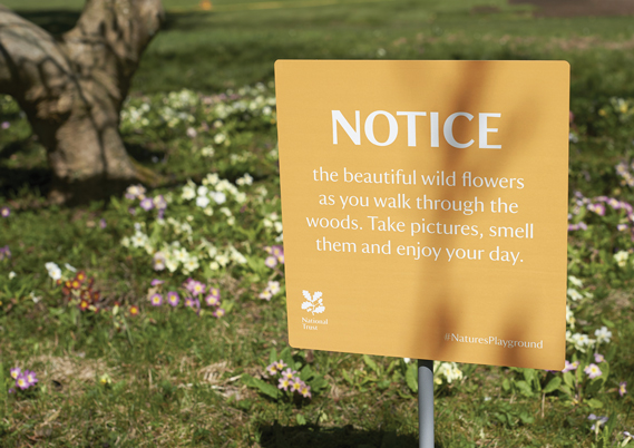
A tongue-in-cheek campaign for the National Trust was launched in the East of England late last month.
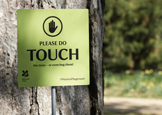
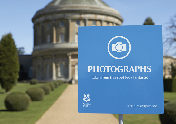
The posters, which are placed in strategic locations across the National Trust sites, encourage visitors to enjoy their natural surroundings, using lines like 'Keep on the Grass' and 'Please Do Touch'.
The signs are designed by The Click Design Consultants and also encourage people to use the hashtag #NaturesPlayground as part of the light-hearted campaign which will feature in print ads, posters and promotional literature.
Labels:
Advertising,
Clever,
Click Design Consultants,
creative,
fun,
Funny,
humour,
Marketing,
National Trust,
Natures Playground
How to write a press release that gets attention
This 'How To Guide' has been written by The Think Tank's PR Director Samatha Dawe as part of our on-going sponsorship of B2B Marketing's PR Knowledge Bank.
There have been many tips offered for writing press releases. The key factor is to write a release that gets the main points of your news across clearly and gains the reader’s interest (whether a journalist, blogger or investor etc). This is simple but sometimes hard to do when you may be loaded with information that you think could be relevant.
It’s wise to write down the core news elements when you start to prepare your draft. There is nothing to stop you following this release up with a subsequent release, if you have more news or a progress report to give.And a word of warning: don’t make claims that you can’t back up. You may think this makes the release more attention-grabbing but if you can’t back up a claim with facts and figures, don’t put it in. A good journalist will check the facts. Your competitors may read it and counter your claims too.One of the best pieces of advice for preparing a release I was given was by a journalist, who referred to Kipling’s Six Honest Men. At the time I had to look that up, so to save you doing so here is the appropriate reference:
“I keep six honest serving men (they taught me all I knew);
Their names are What and Why and When,and How and Where and Who.”
First paragraph
The Kipling reference relates to the fact that you need to contain all of the elements of the story within the first paragraph of your release. That’s because of time pressures. The rest of the release might not get read, but if you have the elements of the story in the opening paragraph this is what will hook the reader. You can work through the six honest men as a check. Don’t forget to put the date when you are issuing the news, and if the story is time sensitive, and the time too, in this first paragraph or just above it.
Targetting
Who are you writing the release for? Make your releases relevant; you may need to prepare two versions of the same news release for example if you are sending one out to the trade press and one out to the local press. What the journalists will engage with is different in terms of the content and what their publications will be looking for in terms of news, even though the core story itself will remain the same.
Language and clarity
Use language that is straightforward and business-like. Don’t waffle. You can leave further explanations and references to technical information for the ‘Notes to editors’ (see below). As a rule of thumb, abbreviations should be spelled out in full the first time you use them, even if you think that everyone knows what the letters stand for eg: Department for Communities and Local Government (DCLG). After writing out it out in full the first time, you can use the abbreviation thereafter. Use standard measures consistently - don’t mix them in different references: the box measured 50cms high and one inch deep. If this is what you have been given, go and find the correct measurements in imperial and metric of all dimensions.
Quotes
Subsequent paragraphs expand the story and a quote is usually included (not necessary if you are targeting the traditional broadcast media though). Adding in a quote from a company spokesperson or an agreed third party adds interest and can help bring a story to life. You can also use more conversational language in the quote otherwise it can feel wooden. If one of your staff has won an award for example, have a quote from them too. Killer quotes are passionate: “We have won this award through the efforts made by all of our staff here at Widgets Ltd over the past 12 months. We couldn’t have made this sort of progress without this sustained effort”. Rather than predictable: “We are very pleased that Widgets Ltd has received this award.”
Notes to editors
This is a really useful convention to be aware of. Editor’s notes appear at the end of the release and should be written under a separate heading ‘Notes to editors’. This is the place where you can put in more detailed background information, appropriate web addresses; expand on sources of data etc. It shows you can back up what you are talking about with more context. Depending on how the journalist writes their story this information may or may not be included. Put in a short background paragraph on your organisation here too and the website address.
Final check
Take time to proof read your release before you send it out. It is often worth getting a colleague to give it a proof too as they will often see things that you haven’t because you wrote the copy. Don’t rely on spell checks; we’ve all had that occasion when the spell checker has changed the original, misspelling word into something quite different.
Labels:
B2B,
How to,
Knowledge Bank,
Marketing,
PR,
Press release
Wednesday 5 June 2013
Kmart continues down the almost rude route
After their 'Ship my pants' advert, Kmart and agency DraftFCB have created a new borderline ad.
This time promoting fuel prices, they use American expressions to create a rude sounding commercial with their 'Big Gas Savings' spot.
Perhaps not as funny as the previous advert, mainly as you have an idea what to expect, but it still has some funny moments and does lead you to wonder where can they take this next.
Watch the advert below.
Scrabble points equal Wi-fi minutes in Paris
In this age of smartphones, tablets, emails, text messages and instant messaging, one thing has become slightly neglected: spelling.
To try and address this, at least in part, Scrabble and Ogilvy Paris have created wi-fi hotspots in areas that normally have no internet connection across Paris.
The catch? You have to earn your time by playing Scrabble. Given some letters users must create a word, the higher the scrabble score for the word, the more wi-fi minutes they get.
A clever idea to promote proper spelling, Scrabble and remind people of the fun they can have with words. Take a look at the video case study below.
Scrabble WiFi - Case Study from Ogilvy Paris on Vimeo.
Labels:
Campaign,
Clever,
creative,
interactive,
Marketing,
Ogilvy Paris,
Scrabble,
wi-fi
Subscribe to:
Posts (Atom)