Friday, 19 April 2013

Design of the Year award winner unveiled

gov.uk website Morth WheelKit yamoyoThe Design Museum in London has announced the  winner for the 2013 Design of the Year Award, the Gov.uk website!

The website, which won by a unanimous vote, was chosen for it's simplicity and ease of use, being built to allow visitors to quickly find the services they are looking for.

Chosen from a shortlist of seven catergory winners,  which were unveiled on Wednesday 10th April, the overall winner was announced on the evening of 16th April.

The catergory winners include a folding wheel for wheelchairs, the Medici chair and a medicine packaging designed to fit between bottles of coke.

The Catergory winners are as follows:
Architecture: TOUR BOIS-LE-PRÊTRE, PARIS
Designed by Frédéric Druot, Anne Lacaton and Jean-Philippe Vassal

Digital: GOV.UK WEBSITE
Designed by Government DigitalService

Fashion: DIANA VREELAND: THE EYE HAS TO TRAVEL
Directed by Lisa Immordino Vreeland

Furniture: MEDICI CHAIR
Designed by Konstantin Grcic for Mattiazzi

Graphics: VENICE ARCHITECTURE BIENNALE IDENTITY
Designed by John Morgan Studio

Products: KIT YAMOYO
Designed by ColaLife and PI Global

Transport: MORPH FOLDING WHEEL
Designed by Vitamins for Maddak Inc.

Previous winners of the award include the Olympic Torch by BarberOsgerby and the Plumen 001 light bulb by Hulger and Samuel Wilkinson.

The exihition will remain open until the 7th July 2013, further information can be found on a previous blog post here.

Cheese brand's ad girls mock diet adverts

Ad girlMost diet food products try and sell themselves as a route to a better life, not this Irish cheese brand. 

They decided to break the mould and poke fun at traditional advertising with it's ironic 'girls from adland' video. The advert from Kerry Low Low features the standard three types of ad girl, the smug girl, the ditzy girl and the muffin girl. Each has a trait you may recognise from a number of diet food ads. 

Clever and humorous whilst also obvious - it even has a catchy song.

Have a look at the video below. Enjoy!


Thursday, 18 April 2013

Milan Design Week 2013 Showcase

Pure shoeTools for Life3 Nuns StoolMilan Design week took place at the beginning of the month, an event that showcases the latest designs from around the world, with a focus upon furniture.

Many architects have worked in collaboration with manufacturers to design pieces to be shown here, and so ArchDaily has compiled a list of what they feel are the Best Architect Designed Products from the week.

The list includes work by Jean Nouvel for Ruco Line, where he explored fashion, creating Pure - a high quality trainer that idolizes “purity of form”.

Also featured is Tools for Life,  a new furniture range designed by OMA for Knoll and Ron Arad’s 3 Nuns Stool for Moroso’s American Collection.


Take look at the full list here.

Kmart ad borders on profanity

KmartKmartIn an unusual stance, American chain Kmart has released an ad on YouTube that plays on a certain phrase. The idea of the advert is to promote the concept of having your purchases delivered to your door direct from the store, including clothing and furniture.

The concept, created by DraftFCB Chicago, uses American colloquialisms of shipping instead of delivery, and of course pants instead of trousers.

Whilst only currently being shown on YouTube, the video has in a short time gained close to 10 million views, which could be enough for the company to decide to give it some air time on main-stream television.

The whole add is very much a clever play on words, all the while bordering on profanity, so be careful about putting the volume too loud!


Take a look at the ad below and let us know what you think.


Wednesday, 17 April 2013

Interactive sculpture in motion

FluidicFluidicFluidicA new collaboration between Hyundai's Advanced Design Centre and Berlin-based WHITEvoid, an interactive art and design studio, has created Fluidic.

The project sees 12,000 suspended spheres acting as 3D pixels or voxels which are illuminated by an array of high-speed lasers. The magic happens thanks to 3D cameras that detect a person and react creating patterns and shapes based upon their movements.

The piece was part of Hyundai's involvement with Milan Design week, the third time it has participated in the show, and was housed at the Temporary Museum for New Design. The interactive sculpture was inspired by nature and its ability to continuously adapt to a changing context, which Hyundai think of as part of their general design philosophy.

On April 8, the day of the preview, the German choreographer Nikeata Thompson directed a special performance featuring art, music and dance in the presence of the press and opinion leaders. In the days dedicated to the public Jan Jelinek of SCAPE, a seminal figure in contemporary electronic music, gave a special performance describing the rhythmic confluence between design and sound titled "Fluidic Art meet Fluidic Sound ".

Whilst many would have missed the chance to experience this for themselves, as it was only open to the public on the last weekend of Milan Design Week, 13th -14th April, there are plans to take it on the road, updates to be posted on the Fluidic page.

Watch a video of the sculpture in action below and visit the Fluidic page for more information and images.


FLUIDIC - Sculpture in Motion from WHITEvoid on Vimeo.

Heat-sensitive business cards

Thermal cardsThermal cardsthermal cardsThe thing about business cards is that unless someone really wants one from you they tend to use it for other things.

That's why creative business cards always grab the eye, especially these ones designed for photo producer Natalie Daniels.

Created by Austrian graphic design studio Bureau Rabenstein, these business cards look like undeveloped polaroid pictures, but the black space then takes on the image of anything that touches it.

The cards are produced with a special thermo-sensitive black ink under the surface of the card, which takes a temporary imprint of whatever it comes into contact with (providing sufficient heat of course).

Whilst the cost of these would be a lot greater than normal cards, they definitely wouldn't be easily thrown away and would leave a more lasting impression than your hand would on the card itself.

Take a look at more images here.

Let us know your thoughts on creative business cards.

Art that's good enough to eat

Final 50Final 50Final 50In Australia Kit-Kat decided to commemorate their limited edition white chocolate bar by holding back the last 50 and melting them.

But that isn't the full story, they got illustrator Mike Watt, to use the melted chocolate and crushed biscuits to make some incredible posters using only a scalpel remove any unwanted chocolate.

The posters won't last forever as after a while the hard chocolate will crack and break away from the canvas, but before all that happens they have managed to post them all up on their Facebook page. 

The designs have been called Kit-Kat White Final Fifty and is a great example of creative art and design.

Take a look at them here.

Pass the time with this Street View Hyperlapse

Street View HyperlapseStreet View HyperlapseIf you've managed to tear yourself away from the last time-waster we shared with you, Google's 3D marble Maze, then perhaps it's time you had a play with another Google favourite; Google Street View Hyperlapse.

Developed by the team at  Teehan + Lax, a Toronto based digital utility designer, the hyperlapse works by taking images saved on Google Street View, then speeding them up.

To create your own, you choose a location, select starting and end points and then a focal point, the focal point is the icing on the cake, it will allow you to see an image as the camera approaches and passes, simply recreating a car journey as you pass a point of interest.

Watch the video from Teehan + Lax below, then have a go yourself here.


Google Street View Hyperlapse from Teehan+Lax Labs on Vimeo.


Seat's money saving brakes

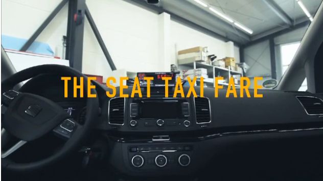
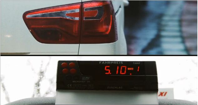
Seat Taxi FareSeat Taxi FareCar manufacturers sometimes have a hard time relating the latest money-saving technology in their cars to their customers every day lives. Seat Germany may have managed it with the help of Grey Worldwide Dusseldorf.

To demonstrate how their new "Brake Energy Recovery System" which saves the energy normally lost during braking and reuses it when the accelerating, they fitted out one of their Seat Alhambra's as a taxi, added some cameras and a special glitch with the meter.

A clever marketing ploy to show consumers how they can save money, the video is definitely one to watch.

See it below.


Get the most out of your LinkedIn Company Page

Linked InAdobeHubspotProfessional networking site LinkedIn has produced a useful little slideshare which gives the top ten tips for Company Pages.

They asked for tips from some of the 2012 Best Company Page winners, which included Adobe and Hubspot.

At the end of the presentation LinkedIn summarise their 3 main tips for better engagement;
1. Add an image
2. Post status updates
3. Add products or services

The reasoning for these three? Imagery speaks more to people, hence why Pinterest and Instagram grew so quickly. Status updates keep you in the mind of your followers and of course having your products and services allows people to see what you do without having to click through to your website.

Other comments to take away from this would be:
'Before posting an update, ask yourself - "Would I want to read this story? Would I want to share this with my connections?"'

'Listen to your audience. Look at the Company Page Insights, read comments, make connections'

Take a look at the full list here and let us know which tips you like the most.