Sunday, 29 July 2012

Amazing images caught by Google Street View

Google Streetview 1Google StreetviewGoogle Streetview imagesGoogle Streetview ImagesThe 'Nine Eyes of Google Street View' is a photo project by artist Jon Rafman named after the nine lenses mounted on a Google Street View camera.

He has collected many of the strange and beautiful images that Google has capture by accident from around the world.

See more of these amazing, weird, frightening and striking images here.

Friday, 27 July 2012

Olympics Opening Ceremony Fun

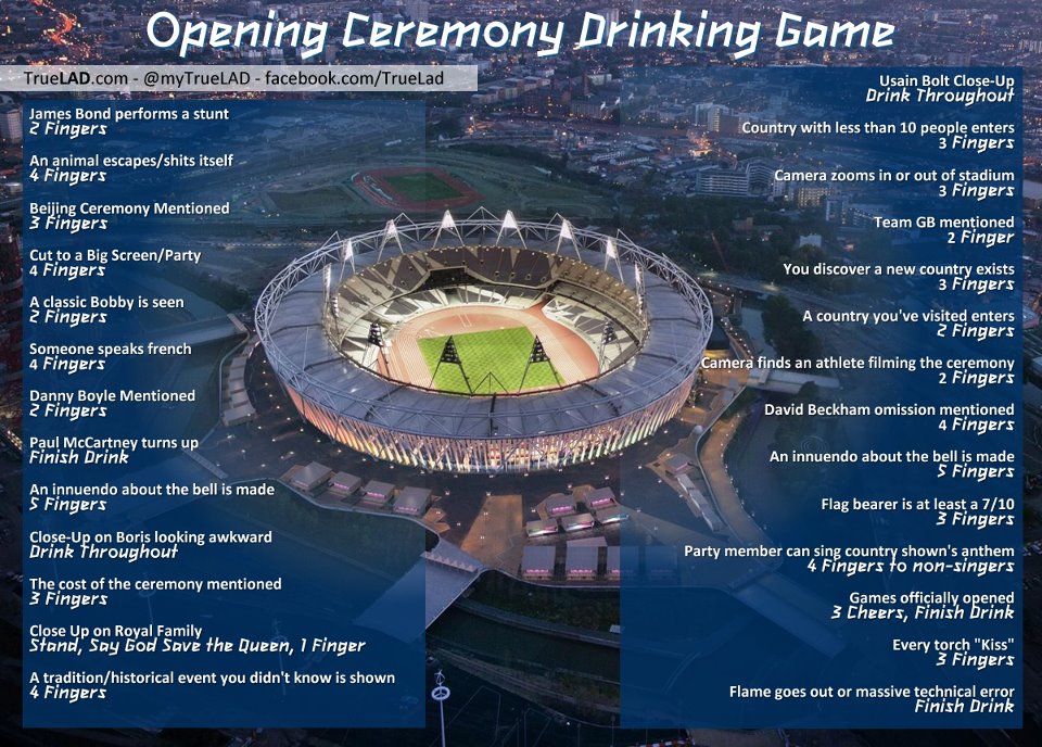
Olympics Drinking GameAt no time does The Think Tank condone excessive drinking however this Olympics Opening Ceremony Drinking Game is great fun.

Something to keep you occupied tonight!

Issued by truelad.com

Wednesday, 25 July 2012

A Dash for Gold with Actuate

Dash for GoldDash for Gold 2Dash for Gold 3BIRT (Business Information Reporting Tools) developer and founder Actuate has launched a fantastic microsite, Dash for Gold,  that allows you to investigate and explore the results of sports competitions of the past and compare them to this year’s games.  

Using their intuitive reporting dashboard they interrogate a wide range of economic, demographic and geographical data to hunt out the trends and enable users to analyse and predict their own medal winners in simple and easy to understand graphical interfaces.  

The Think Tank was asked to create a brand identity for the online application including a detailed infographic which explains what users can expect when they delve into its data.  

The branding was extended to a series of multi-lingual online banners and a video that guides users through the experience. Working closely with Actuate during the app’s development, The Think Tank has provided advice on messaging, design and graphical execution of the microsite and application as well as the marketing collateral that promotes it.  

This simple to use app puts you in control of the data past and present, allowing you to predict this year’s winners alongside a competition for the best dashboard created by users.  

Actuate Dash for Gold includes:  

Did you know: Sports and competition data at your fingertips

All historic and current information at one glance in a dashboard application with sports data that is updated daily. Compare and analyse historic results by country or by discipline. Get timely information on your country's medal count.    

Interactive Analytics: Explore & Play  

The interactive analytics section of the Dash for Gold app allows you to correlate sports and medal information with external data and gain completely original insights. The app brings together different public databases with geopolitical and economic data by country as well as some fun facts. Review performance against world economic and demographic factors such as wine consumption, CO2 emissions or fertility rates. Or maybe you already knew that countries with a low birth rate under perform in swimming?    

BIRT Dash for Gold Contest: Join the athletes and compete  

From 27th July you will have the opportunity to create your own interactive dashboards to uncover trends and fun facts about the world’s top sporting competitions by applying economic, climatic, historical and other indicators to sports data. You'll be amazed at what you find as you drag and drop Google-style gadgets to discover hidden correlations and expose exciting information about your favourite countries and sporting events.  

When you're ready, submit your dashboards to the competition and they'll be published to the community for all to see. Judges will evaluate and choose the top four dashboards and each will win a 32GB 3rd generation Apple iPad with WiFi.  

To get in the game you can find out more and register here to keep current on the latest updates and contest announcements.    

On the go – Mobile Dash for Gold  

Keep your sporting facts handy wherever you are with mobile access to Dash for Gold. After registering, you will receive a link to access daily updates to the latest competition results and figures. Dash for Gold Mobile has been optimized for iPad and viewable on most tablet browsers.

Get predicting here and delve into the facts.

How to deal with cold callers

Prank callsIf you are sick of receiving annoying sales calls then this clip from the States could give you some ideas of how to make sure they never call again.

A very amusing prank.

Inappropriate domains that seemed a good idea at the time

Inappropriate DomainsInappropriate DomainsHere are some great domain names that have unintentional meanings - seemed like a good idea at the time.

See many more on makeuseof.com - good for a giggle.

Push-Up bus comes to London

Push Up BusCzech artist David Cerny has brought his London bus that does push ups to Islington in time for the Olympics.

He created The London Booster by attaching huge arms, suspension mechanics and adding groaning sound effects to the 1957 double decker bus.

The Czech artist commented that the piece could be seen as ironic because push-ups are "a common exercise for every sportsman" but also punishment.

It has been placed outside the Czech team headquarters in Islington, London for the duration of the games.

See it in action below:

Monday, 23 July 2012

Striking illustrations of unusual words

Graphic DesignIllustrationProject Twins GraphicsThese great illustrations are part of a series of bold graphics and visual wit that are used to interpret and represent a collection of strange, unusual and lost words.

The designs are produced by The Project Twins, a graphic design and illustration studio in Cork, Ireland.

The full collection was exhibited at the MadArt Gallery Dublin during DesignWeek 2011. It consisted of 26 50cm X 70cm Giclee Prints on Hahnemühle 100% Cotton Rag (each in a limited edition of 10).

You can see many more of these striking designs, in fact a complete A-Z,  here.

These works are: 

1. Acersecomic    - A person whose hair has never been cut.

2. Biblioclasm    - The practice of destroying, often ceremoniously, books or other written material and media.

3. Dactylion    - An anatomical landmark located at the tip of the middle finger.


Sunday, 22 July 2012

Funny ads do no better that straight ads

Huggies Funny AdHere's some interesting research from the States that funny ads are no more effective than others.

Ace Metric looked at the ads that ran during the Super Bowl. Apparently one in five TV ads in the States are funny, and Super Bowl ads are three times funnier than the rest. But none of this makes much difference in selling stuff, according to new research by syndicated ad-testing firm Ace Metrix

The Index compares brand to average, so Doritos ads had 6.35 times as many people who found them funny as an average ad in the study. The Ace effectiveness score takes into account a variety of rating factors, including how much consumers like the ad, pay attention to it, and are persuaded by it to want the product or service.

Find out more about this study on AdAge. Makes interesting reading.

Does anyone know of similar studies in the UK?

See one of the funniest ads below:

Giant penguin towers over London

London Zoo penguinLondon Zoo has announced plans to to transform London's iconic Gherkin building into ‘The Penguin’  over the summer.

ZSL London Zoo has commissioned a production team to draw up a dramatic redesign of the famed skyscraper to remind visitors to the capital not to miss their penguins in 2012.

They plan to approach city bigwigs with the bold concept of turning the prominent Swiss Re Building – more commonly known as The Gherkin – into a giant penguin.

Not sure whether this idea will fly, especially being a penguin.

See more over on London Zoo's website.

Giant fish wash up on beach in Rio

Fish Rio +20Rio +20 Fish SculptureRio+20 Fish on BeachThis enormous outdoor installation of fish is part of the UN Conference on Sustainable Development (Rio+20)  and was constructed using discarded plastic bottles on Botafogo beach in Rio de Janeiro, Brazil.

The sculptures are illuminated from the inside creating a pretty spectacular light show at night.

See more over on this Rio+20 Flicker set.

A difficult colour choice

fifty Shades of GreyMybuilder.com has created their very own interpretation of the 2011 erotic book 'Fifty Shades of Grey'.

In their version Mr Grey is seen making a very very hot and steamy job of choosing which grey to decorate a room with. Sizzling.

Enjoy!


It's all in the movement

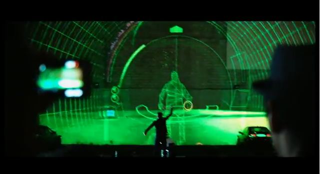
Music Project This interesting multimedia music project, called ‘Can’t Help Myself’, is the result of an ambitious challenge posed by V Energy to music producer Joel Little (Goodnight Nurse, Kids Of 88) and a part of the V Motion Project.

The idea was to create and perform a track using only the body’s movement. With the help of technology experts, motion graphic artists, dancers, Burundi drummers, guitarists, marching bands and the vocal talent of Brandon Black from The Wyld, ‘Can’t Help Myself’ was created, V was the catalyst for this true multimedia collaboration between experts in various fields.

See the video below or download the track here.

Monday, 16 July 2012

A world without textiles - Ouch!

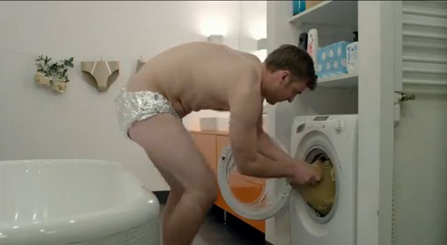
IKEA AdvertisingJust imagine a world without texttiles - this is what this ad for IKEA from the States does - tin foil knickers and all!

Makes you thankful for a nice soft towel and comfy pillows.


By McCann New York

A smiley ad to brighten your day

Smiley HouseHere's a really sweet ad for Nest, a thermostatic control company in the US.

It made us smile in a very rainy London.

Enjoy!

B2B Marketing Magazine's editor speaks at BMA Conference

B2B Marketing at BMA Conference
B2B Marketing Magazine's Director of Editorial and Content, Joel Harrison, recently spoke about current trends and challenges in European business to business marketing at the International Business Marketing Association Conference.

He spoke about the impact of the European economic crisis on B2B marketing activity, the explosion of East London's tech city and digital entrepreneurship, how European attitudes towards social media have changed and much more.

See his presentation below:

A tent in the sky

TentsileThis is one for those of you that like camping but hate the bugs.

Dubbed Tentsile, this modern tree house looks very much like an airborne tent but the designers insist that it is a treehouse.

It has been designed to be set up in just half an hour and is made out of waterproof polyester which makes it ideal for use in almost all climates.

It can be hung from its self-supportive base or anchored from trees, is offered in 2-person, 5-person and 8-person versions and provides the same comfort of cohabitation as a tent with the same level of functionality as a tree house or a hammock.

It weighs between 11-18 lbs with the two-person Tentsile model retails for $3,000 and the 8-person model costs just over $12,000.

Find out more here.

Sunday, 15 July 2012

A quiet cup of tea

TetleyThis ad for Tetley tea from Australia takes having a quiet cup of team to the extreme with a very clingy husband and a wife looking for escape.

Ahhhhhhh!


Ad by Clemenger BBDO

Individuals in the crowd

Individual PhotographyIndividual in the CrowdIndividualsThe » one « is a project by Nicolas Ritter that focuses upon individuals within a crowd.

The artist say, 'It particularly imitates the way in which the human eye observes: not viewing a crowd as a crowd, but observing little micro-scenes inside of it.

All images are taken in London and feature static photography with one individual moving in the crowd.

Very interesting - some moving individuals are more easy to spot than others.

See all of the project here.

Interactive Gallery of Lost Art

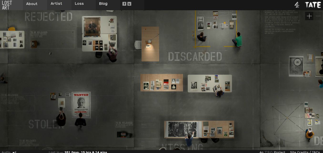
Gallery of Lost ArtGallery of Lost Art'The Gallery of Lost Art' is a year-long online exhibition curated by the Tate and developed by UK creative studio ISO.

It displays artworks that have disappeared for reasons of theft, arson, rejection or just having been discarded.

'Art history tends to be the history of what has survived,' reflects the gallery's curator Jennifer Mundy, 'but loss has shaped our sense of art’s history in ways that we are often not aware of.

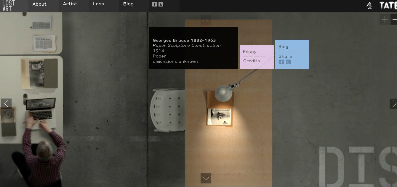
'The website is visually structured as an open warehouse floor, viewed from above, with different chalk headers on the ground delineating the subject of that area of the gallery: destroyed, stolen, discarded, rejected, erased, or ephemeral. users can zoom into particular areas, and by clicking on specific projects they can access essays, photos, film footage or interviews, and other material about the artwork.'

Why the the piece of art was lost is also documented and the site will add one new work each week for six months and six months after this the website will disappear itself.

Click here to go to the site.