Tuesday, 15 May 2012

Serpentine Gallery Pavilion 2012 design unveiled

Serpentine Gallery Pavilion
Serpentine Gallery PavilionThe design of the '2012 Serpentine Gallery Pavilion' has been unveiled and is a collaborative work between Swiss based architects Herzog & de Meuron and Chinese architect Ai Weiwe.

It will officially open on 1st June and be open to the public until 14th October

Visitors will go five feet beneath Kensington Gardens to see the hidden history of previous pavilions, represented by eleven columns. A platform roof with a reflective surface of water floats 1.4 meters above the recessed floor plane and is visible to people on the lawn of the park above. Apparently the water may be drained at times transforming the roof into an impromptu dance floor or event space.

See more of this pavillion on Design Boom.

Flying high with Virgin Atlantic

Virgin Atlantic Upper Class Cabin
If you, like us, have never had the pleasure of travelling Upper Class with Virgin Atlantic then see what you've been missing.

The first Virgin Atlantic A330 flight took off from London to New York recently with a brand new bar and Upper Class cabin designed by VW + BS Studio in partnership with the Virgin Atlantic team.

Definitely not what you expect to see at 30,000ft.

See more of this amazing new cabin on Design Boom.

Miniature sculptures stand tall

Nic Joly Sculpture 1
Nic Joly Sculpture 2Nic Joly Sculpture 3
This collection of miniature figurines frozen in small-scale narratives by Hampshire based sculptor Nic Joly are entitled 'Under Foot'.

The concept originally started as a hobby in 2006, creating miniature toys to entertain his two children. It's now become a full-time occupation, creating sculptures of tiny people, typically moulded at a height of one centimeter. 

These are just a few of his interesting pieces - see a lot more here on Design Boom.

Monday, 14 May 2012

New W Hotel in Koh Samui is a sight for sore eyes

W Hotel
W Hotel Koh SamuiW Hotel
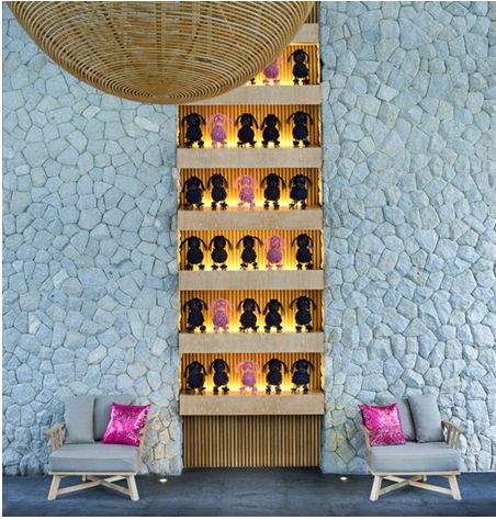
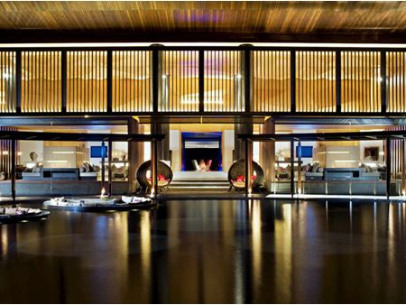
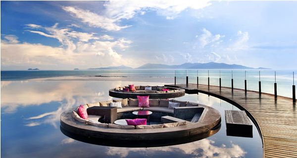
The New W Hotel in Koh Samui is just stunning.  In an amazing retreat round lounge spaces emerge from the water to create a spectacular place to relax.

The hotel overlooks the Gulf of Thailand and this beautiful escape was designed by MAPS Design studio as a collection of imagined spaces shaping a welcoming paradise. 

See more of the New W Hotel on FresHome.

What colour is fashion across Europe?

Pimkie Colour Forecast
Pimkie Colour ForecastThis project by Pimkie called Color Forecast has been developed by Pedro Cruz and runs feeds from high definition cameras in Milan, Paris and Antwerp to track the colour of fashions worn across the cities.

The software analyzes the passing colors and shows in real time which colors are worn most often, then the colors are compiled into an infographic to see how trends evolve..

Can this forecast the trends and how our colour tastes change over the seasons? An interesting project.

See the website here and see how it works below.


Buttered-cat paradox comes to the screens in Brazil

Buttered Cat
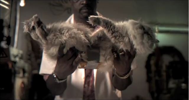
If you haven't heard of the buttered-cat paradox then this ad by Ogilvy & Mather Brazil will make it all very clear.

Combine the law or physics that cats always land on their feet and buttered toast always lands on the buttered side down and you get a limitless source of electricity. The world's energy resource problem is solved.

Not one for cat lovers I'm afraid.


Facebook highlights factors that increase ad performance

FacebookIn an attempt to boost its ad revenue and improve the quality of advertising, Facebook's measurement team is making public its research on the types of ads that work best on its platform.  

After talking with marketers, Facebook identified six elements of ad creative that impaceted upon recall and purchase consideration including two visual elements of focal point and noticeability and four that looked at messaging and a range of things, from whether it's easy to see the brand to whether the ad is succinct and to the point.  

They then asked 109 marketers to rate around 400 ads on each of the six elements. All were from the Facebook premium-engagement format, which appear on the right column of a Facebook page and is restricted by image size and copy length.   All of the ads chosen were brand or product ads rather than direct response.  

The results for recall highlighted three factors that were particularly important: Images needed to have an obvious focal point, the brand had to be clear and the ad needed to fit with the brand's personality.   

Not rocket science but at least an indicator of best practice winning out.  

Failing focal-points were fairly common, due to the lack of space for images, however this was increased by brands which opted for small product images on cluttered backgrounds. This got in the way of consumers recalling brands - therefore simplicity is best.  

The ads should also be clear about the brand they're promoting, which may sound obvious but many brands were obscured in the ads or missing associated brand colours.  

When looking at purchase consideration the main aspect was whether the ad rewarded the viewer. Very important in encouraging interaction.  

"Ads that were rewarding tended to be pretty clear -- there wasn't an overload of information," said Mr. Bruich, who conducted the study with measurement researcher Adrienne Polich. "But [the] rewarding ads also seemed to connect. The information seemed meaningful."  

The importance of offering a reward was the single-biggest creative predictor of an ad's success, which apparently surprised the Facebook team.  

The full study will be presented in the US next month however those that believe that bright colours or crazy fonts would create noticeability will be sorely disappointed as the survey found that this was not predictive of either recall or purchase consideration.  

So it's goodbye to psychedelic Facebook ads and hello to minimalism.

Wednesday, 9 May 2012

Saatchi & Saatchi revamps Thailand office

Saatchi & Saatchi Thailand
Saatchi & Saatchi ThailandSaatchi & Saatchi ThailandSaatchi & Saatchi ThailandSaatchi & Saatchi Advertising in Thailand engaged Supermachine Studio to revamp their offices and have come up with a very creative space.

The brief was to enhance the social atmosphere within the space and encourage staff’s creativity and imagination. Everyday objects have been used throughout and the office has been separated into two zones: the creative zone and the managing zone.

Arch Daily reviews the space and says, 'The creative zone was designed to be open and bright where people can communicate broadly, share ideas and get inspired together as it was important for them to work as a family. On the other side, the managing zone has a darker tone atmosphere yet with colorful decorations in order to show that they too need excitement at work. In between, their lies a playful trophy wall and a bicycle wall for passer-by and facility zone with pink colored walls to create liveliness for the lifeless programs.'

Great fun and very inspiring - see more on Arch Daily.

Photographs © Wison Tungthunya

Shock advertising for journalistic freedom

CJFE
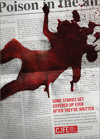
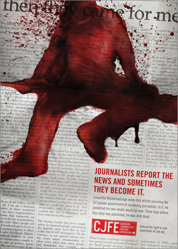
CJFE 2CJFEThis hard hitting press campaign for the Canadian Journalists for Free Expression highlights the plight of correspondents working overseas and the risks they take to bring us the real news.

They were created by agency Juniper Park in Toronto, Canada

Live commercial in New York gets right up your nose

Febreze Live Ad New York
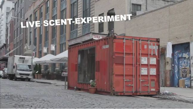
To prove just how good their air freshners are, Febreze held a live commercial in New York city, inviting blindfolded New Yorkers to guess where they were.

The venue was an old sea container that originally held fish - but not what the audience thought.

See how it went below:


Monday, 7 May 2012

Portraits of a conceptual artist

David Talley Portrait
We don't know a great deal about this self taught photographer and conceptual artist David Talley, who is based in Los Angeles, California. however we thought that they were worth a mention.

David Talley Photography
He is currently pursuing a BA in Photography at the University of La Verne and you can see more of his work here.
David Talley

David Talley Portraits

'Visions of Earth' through the photographer's lens

National Geographic
This year's "Visions of Earth" photo series, by National Geographic, has been launched showing some of the best our planet has to offer in terms of visual beauty, both natural and man-made.

National Geographic
Beautiful images that make you think.

National Geographic Photography
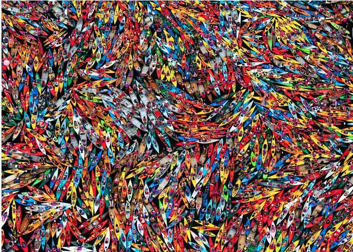
Can you guess what this image shows?

See more here.

Photographs by Joel Sartore, Nacie Battaglia and Alvaro Sanches-Montanes

Georgian service stations a real eye opener

Service Stations
When Georgia built a new road connecting the Republic of Azerbaijan with the Republic of Turkey they commissioned architects J.Mayer H to design a series of 20 rest stops (or service stations).

Service Stationa
The result was were these stunning structures that are located on selected scenic viewpoints along the route. They serve as activators for their area and neighbouring cities, including not only a gas stations and supermarket, but also a farmers market and a cultural space for local arts and crafts.

Service Stations
See  more on Contemporist here.

A rainbow of colour appears over Omaha

Rainbow over Bemis Center
Michael Jones McKean’s
“The Rainbow” Art Project creates rainbows over The Bemis Center for Contemporary Arts in downtown Omaha.

In clear weather the rainbow will appear twice a day, for 20 minutes, and are created using sunlight, renewable energy and 100% captured rainwater.

The project was a decade in the making and represents a collaboration between irrigation and rainwater harvesting experts, Lindsay Corporation, structural and mechanical engineers, atmospheric scientists, Bemis Center and artist Michael Jones McKean

Quite a beautiful project that will start in early June and run until 15th September. 

See more about artist Michael Jones McKean here.

Saturday, 5 May 2012

Pittsburgh Tribune gets to the point with front page mistake

Pittsburgh Tribune
Earlier this week the front cover of the Pittsburgh Tribune - Review's Living section carried a rather blunt statement.

What appears to be an unintentional message was the result of a poor graphic effect applied to the headline "Suit Yourself," 

Whoops!

Toads take to the screen in Ford ad

Ford Advertising
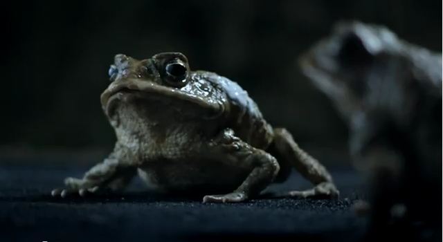
This Australian ad for Ford brings two new stars to our screens - native cane toads.

Produced by JWT Melbourne it is quite humorous and reminiscent of the old Budweiser ads that ran some years ago putting toads (or were they frogs) in the limelight.

Enjoy.